And Why It’s Better If It Doesn’t

At Ranger, we recently presented logo concepts to a client who was puzzled: none of the designs visually represented their specific service. That reaction isn’t uncommon and it’s rooted in a common misconception about what a logo should do.
Let’s clear it up: a logo is not a billboard for your offering. It’s not a summary of your services, a catalog of features, or a “what we do” icon.
Your logo is your identifier, not your explainer.
Here’s why that distinction matters:
1. If You Look Like Everyone Else, You Get Lost in the Crowd
Many businesses default to industry clichés: a heart for care, a tree for growth, a handshake for partnership. These symbols are comforting, but they’re also everywhere. When your logo blends into a sea of similar visuals, your brand loses its edge.
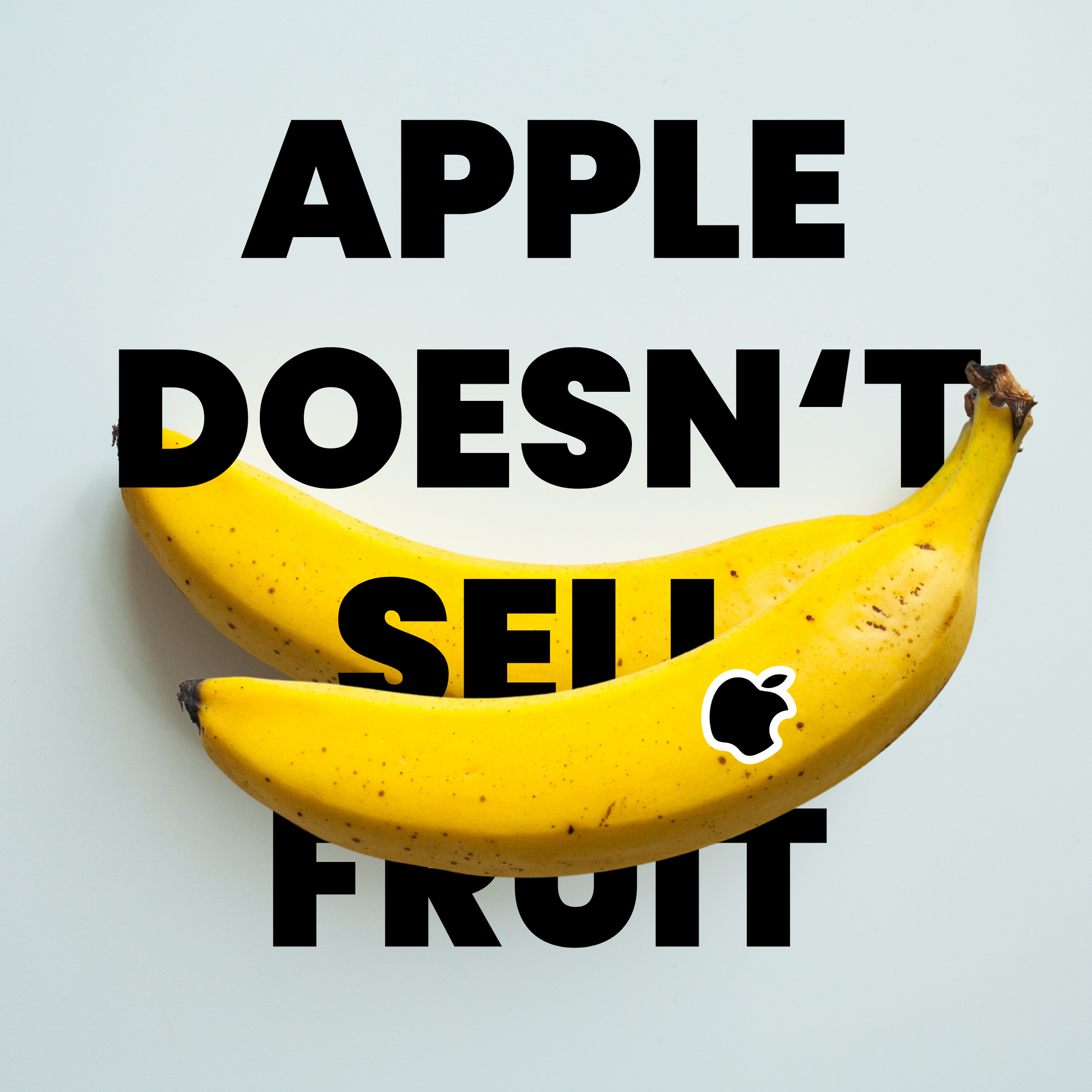
Think about how many banks use shields, how many tech companies use pixels or circuit lines. Now think about Apple’s simple apple with a bite taken out. It doesn’t scream “technology,” but it’s one of the most recognizable symbols on the planet. Why? Because it’s distinctive, not descriptive.
2. Logos That Explain Can Limit Your Growth
What you do today might not be what you do tomorrow. If your logo is a literal depiction of your offering it becomes outdated the moment you evolve.
Starbucks started as a coffee roaster, but their mermaid logo (inspired by maritime mythology) allowed them to evolve into a lifestyle brand without ever having to rebrand. The logo never said “coffee” and that’s why it still works as they expand into music, merchandise, and more.
You don’t want a logo that boxes you in or forces an expensive redesign just to keep up with your growth.
3. Your Logo Should Spark Curiosity, Not Satisfy It
Think of your logo as a flag. It signals who you are and creates recognition over time. It doesn’t need to say everything, it just needs to say you.
Nike’s swoosh doesn’t say “shoes”, it represents motion, energy, and momentum. Paired with great storytelling and consistency, it became iconic. Let your messaging and actions tell the story. The logo just needs to spark interest.
4. Abstract Logos Can Build Stronger Emotional Connections
When your logo aligns with your values rather than your services, it taps into emotion, not just logic. That’s where real brand loyalty lives.
The World Wildlife Fund (WWF) doesn’t show the globe, ecosystems, or people, it shows a panda. It’s simple, memorable, and emotional. It speaks to care, vulnerability, and protection without saying a word.
Abstract marks can grow with you, flex across campaigns, and become instantly recognizable when used consistently.
In Short: Your Logo Isn’t the Story. It’s the Signature.
We believe in creating logos that are true, timeless, and tailored. They don’t need to explain what you do, but they should make people feel something. That’s where the real connection starts.
Need help crafting a logo that leads with meaning, not just visuals? Let’s talk.
By Evan MacLeod
